Our Starting Point
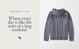
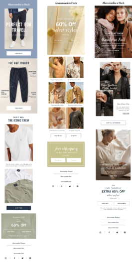
I joined Abercrombie & Fitch to lead our creative marketing concept team and was tasked with re-imagining the brand for a more trend-conscious customer who was willing to pay for full-price new arrivals. Utilizing existing brand codes like our well-recognized serif logo typeface, I created a revitalized style guide and visual language that appealed to new consumer audiences, while maintaining the brand heritage.
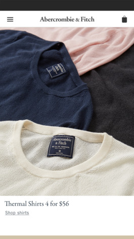
Regular customers had long remained the same, primarily purchasing basics with a preference to purchase on sale items. This behavior forced the brand to place items on discount to generate transactions, negatively impacting overall AUR.
Previous Abercrombie branding didn't feel elevated enough and lacked clear and consistent hierachy. When everything is bolded or capitlized, clear communication loses priority.


Loyalty Program Name and Logo Design
When working through the name for the loyalty program, we user-tested three variables: program name, program tagline, and logo design. We were internally hoping to move away from the name "A&F Club" due to our desires to hint at personalization, evolve the program into a more rewards-based platform, and also add maturity for an older demographic.
Before we could do this, we wanted to test if 1) "A&F Club" held too much recognition for existing customers and if they would feel alienated by a sudden change and 2) if the word "Rewards" needed to be in the name of the program for customers to understand the program benefits.
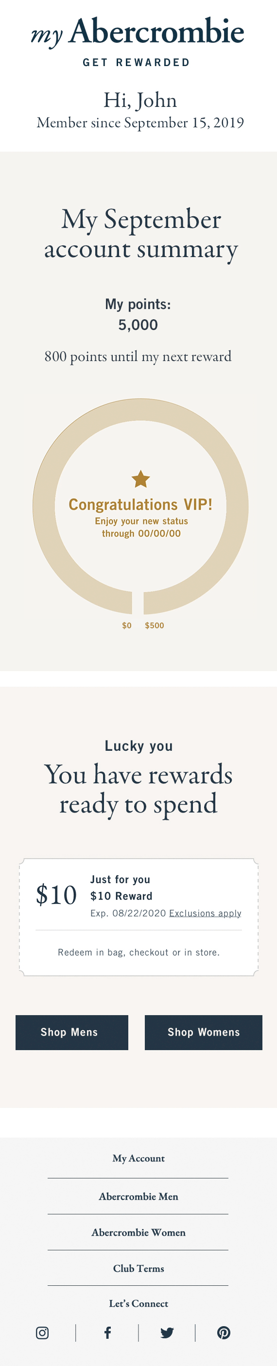
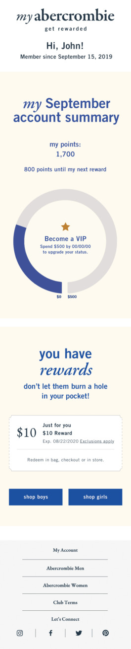
Tracking Rewards
In order to track rewards, we developed a dial to gauge points and status and coupons to communicate when rewards had been earned. Tickets operated as visual rewards indicators, while the elongated ticket fit within the existing shopping bag UI.